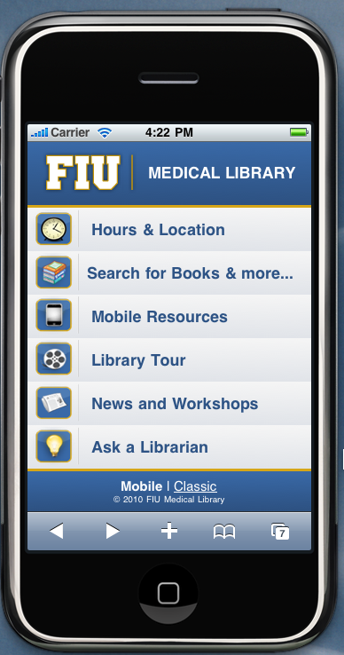
Last Thursday at the new student orientation, I have launched the new mobile website for our library. You can also see how it works from this tutorial.
From the survey of the first year medical students, we have discovered that over 90% of them owned a mobile device or a smartphone and the majority of devices were iPhone or iPod Touch. Since medical students go into the clerkship at hospitals in their third year and they are expected to use mobile devices in order to keep up with reference and research needs at the point of care, the library has been preparing for additional support for students’ mobile devices and the library’s mobile resources. I have added mobile resources to the list of workshops I offer during the semester and created a web page dedicated to medical apps and other mobile databases available on mobile devices. Now the mobile library website should further improve the students’ access to library resources and services.
A little before launching the library’s mobile website, I also had an opportunity to do a Pecha Kucha presentation for Handheld Librarian Online Conference III about how to plan a library’s first mobile website in the right way. At the presentation, I focused more on the project management side of building a mobile website. Although many people tend to think that building a mobile website is mostly a technical work, without proper planning work and appropriate project management, things may not turn out as expected.
Here are my 20 tips for planning right for your first mobile website that I shared at Handheld Librarian Online Conference III.
1
Planning begins with an environmental scan: what your peer library organizations are doing and what your own user base expects.
2
Know what your capabilities and limits are so that you can set a reasonable and realistic project goal.
3
A mobile website is all about users. Find out what they want and what their expectations are and make sure to develop your mobile website based upon these needs.
4
Feature the library services and resources that would attract mobile device users such as a video, SMS reference, or mobile-optimized resources.
5
Recycle for branding. Whenever possible take advantage of a style sheet for a mobile website that already exists in your organization. Using a consistent style across different units of the same organization is also good for branding purposes.
6
Less is more. A mobile website should meet the particular needs of mobile device users, i.e. their needs for information on the go. Do not replicate the entire library website.
7
Do make the scope of your mobile website project explicit. Decide upon how many pages and what content you will be creating and stick to it unless a change is absolutely necessary. Communicate this to stakeholders in advance.
8
Be flexible about funding options. If you are sure that what your users needs cannot be created in-house, look for funding outside the library such as grant opportunities.
9
If you can afford, invest in market research, usability testing, and/or hiring an experienced web developer. Keep in mind that the mobile website exists to offer a better experience for users.
10
Take advantage of many existing mobile frameworks such as iUi, JQTouch, iWebkit, XUI to save development time.
11
Pay attention to a potential scope creep. Keep your focus on the users’ needs, and not all stakeholders’ requests.
12
Define the roles for content providers, usability experts, and web designers /developers in advance for a better design and improved usability of a web site.
13
Avoid perfectionism. Since the mobile devices and markets are constantly changing, do not try to make your site perfect for all types of devices at one go. Research what mobile devices the majority of your users use and make sure to design your mobile web site or web app in accordance with web standards.
14
Before launching it, do let users do a test-drive. Let them try your mobile site on their own devices, and solicit their feedback on both content and design. Find out what they find useful and gain insight from their comments.
15
Launch it! Make it sure that it goes with a bang, so that the majority of your mobile device users would notice the new mobile website of your library.
16
Publicize. Devise a clear plan of marketing your mobile site to your target users.
17
Use both traditional and social media to market your mobile website. There is no bad publicity and the more exposure the better for your mobile website.
18
Stay flexible and be ready to make quick changes. The mobile market and user expectations undergo frequent changes.
19
Make your mobile website fit your users’ workflows and not the other way.
20
Remember to put the piece of codes to track where the visitors come from and what they do, so that you can improve through iteration.
Of course, I don’t mean to say that I have followed all of these twenty things I have just listed here. Depending on the environment, some of them may not be applicable or feasible. For example, at our library, it was impossible to have a content expert, a usability specialist, and a web designer/developer. So those three roles were all played by me. And I continuously reminded myself of keeping in mind which perspective of these three different roles I need to apply to the different stages of building the mobile website.
Similarly, marketing considerations can overweigh other factors. Although I said above to put in the tracking codes for statistics before the launch, since we really really wanted to launch the mobile website at the new student orientation for the maximum exposure and marketing effect, we put the site up in the production server before we were ready for the tracking codes yet. Again, it was not ideal, but considering the alternative of delaying the launch and having a struggle with marketing the mobile website later, what we did was clearly a better move.
So, these 20 tips are only a guideline. But no matter what your environment is, it certainly helps to plan the whole project from the beginning to the end as it helps you to adjust your project to work with particular conditions, under which you will have to develop your own mobile website. And here are my presentation slides.


