What to place and where to place the many elements of a website’s homepage is often the result of a delicate negotiation and compromise between what users want and what the site owner wants. While the most ideal case is surely when these two things completely match, this doesn’t happen often for reasons you can easily guess.
I have recently worked with a vendor of a database called UpToDate to implement their new feature of automatic CME (Continuing Medical Education) Credit tracking through the EZproxy of my institution. This new feature brought some interesting changes to their database homepage, which I thought would be a great example to discuss in the context of Web usability.
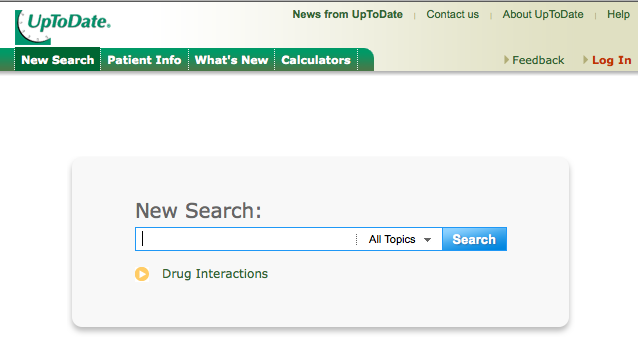
Their homepage used to look like this. Very clean and to-the-point. Their Googole-like homepage offered exactly what users want most, searching their database for the information they need often at the point of (medical) care.
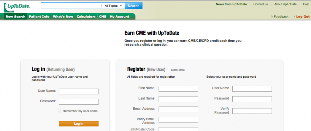
After the introduction of the automatic CME tracking feature, however, their homepage has changed as shown below. To be exact, they show the new homepage first-time when a user enters the site and then every 15 days or so to prompt users to register.
There are some pretty obvious usability issues in this new homepage due to the prominent Log in box and Register box as well as the big heading that reads “Earn CME with UpToDate.”
- To a new users, the whole purpose of this database appears to be Earning CME.
(I am pretty sure this is not the first impression this database wants to give to its first-time visitors no matter how well known the database is! The most important role of a homepage is to answer the question for a user: “What does this site do for me?”) - To a user who just got to this database, seeing another Log-in vs. Register box makes them doubt if their initial authentication was successful.
(If you run a website, you do not want to make your user worry if their first action to get into the site was a failure!) - To experienced users, it is confusing where to do what they used to do, which is what they really want from this site. That is, running a search for clinical information.
(You don’t want your user to “THINK about” how and where to do the most primary action in your site, ever! It should be obvious.)
In designing a homepage, try to provide satisfying answers to these three questions. Then you are on the right track. If you need to add additional information, do so without making the homepage fail to answer these questions first.
- What does this site do for me?
- What first action should I take to try what this site promises?
- Where and how do I do that action (at this second without a need to think)?
Now that you have given a thought about the usability of this example, how would you re-design this page while providing information about the new feature that requires log-in and registration? I will leave that as something for you to think about!


Hello:
This is why UpToDate offers the assistance of Regional Client Trainers and assistance with a messaging/marketing campaign at no cost to help inform users of the change.
Users should be made aware of the change and of what it will do for them. I would encourage you to connect with your UpToDate account manager and learn more a out this.