I am presenting about usability issues in library websites in Computers in Librareis 2011 in a few weeks. So needless to say, I have been thinking a lot recently about usability. Today, having updated all apps on my iPhone, I noticed that the Twitter iPhone app finally made some changes in its new message user interface (UI) which makes it more usable.
However, the new UI fails in some respects, and the new app introduces a different usability problem, which is often the case with website redesign. So let’s pretend the new Twitter app is a re-designed library website and see what its pluses and minuses are in terms of usability.
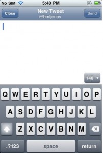
This is how the old Twitter iPhone app’s new message screen looked like. (Screenshots thanks to @bmljenny.)Â It is very basic until you press the “140 â–¼” button on the top right corner over the keyboard.
Once you press that button, however, the whole new world of functionalities unfolds. Taking a photo, inserting an already-taken photo, geo-tagging, adding Twitter user by his/her Twitter username, adding a hashtag, and shrinking a URL is all just one touch away.
Unfortunately, not many people noticed this button; many users weren’t able to take advantage of these useful functionalities.
I must say, the design of hiding these functionalities behind the “140 â–¼” button is both clever and stupid. Clever in the sense that it made the new message UI clean and simple. But quite stupid in the sense that the button that holds these functionalities don’t stand out at all that it resulted in those functionalites being often completely unknown and undiscovered to users.
One of the great usability principle is, in my opinion, is this :
Stop being clever and make things super-obvious.
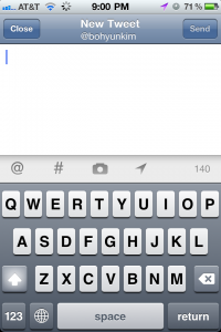
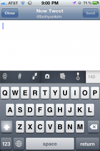
The new Twitter iPhone app followed this principle and corrected the issue by removing the “140 â–¼” button. Instead it added a gray bar with four icons that stand for usernames, hashtags, camera, and geotag. I would say this is an improvement since users can now clearly see the icons when they are in the new tweet screen.
However, these icons are not the same as the previous icons used in the old Twitter app. Geotag icon has changed the appearance and the camera icon now functions for two previous features of taking a photo and adding a photo from the photo library.
One of the pitfalls of re-design is that even when improvements are made, often the web team (designers in particular) are not satisfied with just fixing the existing issue. They are tempted to make changes ‘for uniqueness’, which tends to raise rather than solves a usability problem.
So now Twitter seems to have gotten rid of perfectly useful two icons — photo library and shrink URLs.
If I were to redo the screen, I would keep the same icons in the previous app. After all, some users have discovered and used these hidden functionalities. Why now force them to change their pattern of use?
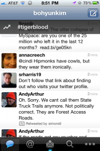
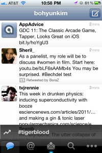
While I was evaluating the new Tweet screen, I realized that the new Twitter app has also introduced a new usability issue to it. The new trending hashtag notification. It appears on top of the tweet timeline.
As quite likely to be intended, since it appears on top and written on a black bar, it stands out. The problem is that it actually stands out more than what users need. It is downright annoying.
This can be easily corrected if the bar appears at the bottom rather than the top. It would be still noticeable enough for those who take interests in the trending hashtag but would not annoy the majority of users who want to quickly scan the timeline from the top to the bottom.
Because of this this new and un-user-friendly trending notification, the overall reaction to the new Twitter app would be more negative than positive.
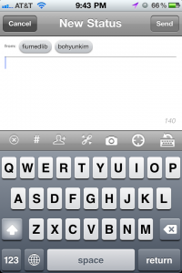
Furthermore, what was really interesting to me is that even after the re-design, the new Tweet screen of the new Twitter app does still slightly fall short of the new Tweet screen of the Tweetdeck app. Compare my revised version of the new Twitter app above with the following Tweetdeck’s new tweet screen below. Pretty much what I have done ended up making the Twitter app look almost the same as the Tweetdeck’s existing new tweet screen.
Sometimes, a good design comes from benchmarking a competitor’s product and from following conventions that users are already familiar with.
Can you think of an example of a library website that failed to be user-friendly while trying to be clever and/or from poorly benchmarking another library website? If you work with a library website, this is a good thing to think about.


I read this post to see if you knew where the URL shortening feature went. I can’t find it at all!
Does the URL shrinking happen automatically now? Perhaps that’s why they removed that option.
Unfortunately downloading the new update seemed to break the app completely for me, so I will have to use TweetDeck until I can get it re-downloaded and transferred from my computer. That is the biggest usability problem of all. 🙂
@Steve: The URL shortening icon is gone and the feature seems not to be automatically applied. I am puzzled as well why Twitter decided to do so…
@Margaret: To believe it or not, it does not seem to work automatically. How strange… Yes, being unable to download is the biggest usability problem. I had the FB app that went haywire and refused to upload photos for months. I had to delete and reinstall. : (